Saturday, December 10, 2011
Tuesday, October 18, 2011
Shoe Logo
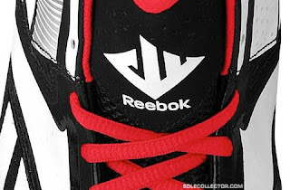
The other week, a good friend of mine asked me if I would design a logo for him. He wanted it to be a design he might put on a pair of basketball shoes to sell, like the one for the John Wall basketball shoes:

If you can see, the logo is a combination of a "J" "W" and "11".
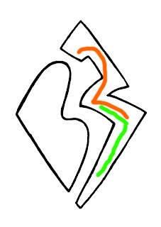
So I set my pencil and paper to work to draw up something similar, and this is what I came up with with his initials and number of choice: BW27.
IN BLUE!

IN ORANGE!

(If you can't tell, this is where I incorporated the 27:)

(This design belongs to myself and B.W. and no one else may use this without written consent.
I'm getting 20% of his profits from this, if he does something with it. (: )
Saturday, October 15, 2011
Youth Group Logo
Our Youth Group has been discussing making some changes this year. One thing we have considered is having a logo to use for things such as T-shirts. I took some time to draw up some ideas, and I mostly focused on a "new creation" concept from 2 Corinthians 5:17. I considered drawing a shoot with some roots, roots showing our growth being deep, but this design looks even better.
[In case the image isn't loading, it is a shoot with three leaves (Trinity concept!) with a shadow as a cross. ]

House Crest
With this new school year, our school decided to add a House system (if you don't know what that is, read Harry Potter.). We have five Houses, and I am the leader of the Elliot House. So, to go with our House and House Hero (Elisabeth Elliot, a remarkable woman), I designed a crest for our House to use.
It includes two spears shaped like the ones that killed Elisabeth Elliot's husband and the four other missionaries with him. The spears form a cross to represent how this tragic death was used to continue to reach out to the tribe and bring them to Christ. The "E" is for Elliot; it was designed by Amy (I cleaned it up a bit), and it provides an original and unique quality to our crest. Our motto is "Victoria de Tragodea" which is Latin for "Triumph from Tragedy"--a saying that relates to how God has created something good from every bad situation Elliot went through (ex. the death of her first and second husband), and from Jesus' death.
Outline

Color
Sunday, September 11, 2011
Sunny Day in September
After days of clouds, rain, and flooding, we finally had a beautiful white-cloud, blue-sky day outside. I grabbed my sister's camera, my memory card, and ran outside to get some shots. I saw two Monarch butterflies near our butterfly bush, and managed to get a good picture of one of them!
Here are some of the best pictures I took:


Wednesday, August 24, 2011
Taken by Tide
So the band formerly known as Far From Rectified has just recently(today!) changed their name to Taken by Tide--this means that I get to create a whole new band logo for them! :D
So this band was just recently created by three of my friends, Brandon, Brandon, and Alec. They haven't posted any music yet, but I've known for years what styles they like, and have an idea of what to expect.
I decided to model their logo after Alec's guitar, to give it the look they were looking for. It also gives the word Tide more of a tide, oceaney kind of feeling, which I though would look neat.
So please, comment and let me know what you think of it!
Here's there page for you to check them out on Facebook!
Band's Logo

Sketch

Photo of Band Members, edited by Picnik.com (their fonts as well)

Sunday, August 21, 2011
College Trip
This week, my family (except my youngest sister) drove down to Arkansas to drop my older sister off at college! On the way down I doodled a lot, and so I figured I would share the drawings with you! There are also some sketches from our stay there, so enjoy!


(All of these and more can be found under my Sketches.)
Tuesday, August 9, 2011
In the Style of Calder
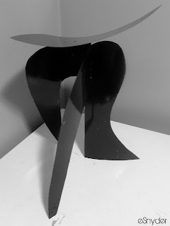
In 9th grade art class, we were told to choose an artist and create a piece of artwork in his or her style. I chose one of my favorite artists Alexander Calder, and therefore created an abstract sculpture in his style. This one is made out of metal(some silvery, easy to cut, but firm kind), held together by some kind of bolt thing(thanks to my dad), and spray-painted black.
This specific type of piece is known as a stabile, compared to the mobile, which (fun fact!) was invented by Alexander Calder himself.
This specific type of piece is known as a stabile, compared to the mobile, which (fun fact!) was invented by Alexander Calder himself.
Thursday, July 28, 2011
Tuesday, July 26, 2011
Sunday, March 20, 2011
Pennsylvanian Farmlands
One weekend in February, we had a nice warm day out, so my sister and I drove out to the "countryside" to take some nice pictures. We packed sandwiches and ate out by an old covered bridge. She got some neat shots of that bridge and a few old farms that were nearby. On the way home, I took advantage of her camera and managed to take some neat pictures while she was driving.
Subscribe to:
Comments (Atom)


