Saturday, November 3, 2012

Hippos


Happy Birthday, Kailey!!!

HAPPY BIRTHDAY!

In Honor of your amazing 18th Birthday, I have not only composed a great photo of hippos for you, I have made it big enough for a background on your computer!!! 
Now you can enjoy these hippos every time you look at your screen!
ENJOY!

Saturday, October 6, 2012

Contact

Hello!

I hope that you have enjoyed my art!

Now that I am slowly becoming more serious about my work, having some contact info may be helpful.
[For now, I am not posting my email, but I will consider it if you contact me through Twitter.]

Friday, September 28, 2012

White Out

My dad came to me a week before school started with a proposition to design a T-Shirt for the Sports Boosters Association to sell at our school.  His only requests were that it could be used for future White Out games, that it incorporated the new Coventry eagle logo, and that he could have it by Friday.

It was a small challenge, but with the help of my friends' (and wonderful sister's) critiques, here is the final result!  The program I used for this is Aviary's Vector Editor, saved in a png format.  They are being given out with the purchase of a Sports Pass; but they are also on sale separately for those who wish to buy separately.


10/6/12 Update: I am the happy owner of the first White Out T-Shirt! Extras are still being sold, so get them while they're here!  More may be ordered in the future, upon demand.
Also, Aviary has shut down it's advanced flash editors, so I have downloaded Inkscape and will now be using that in combination with Photoshop Elements 10 for my photography.
Look forward to more designs!

Tuesday, July 24, 2012

Homemade Stamps

For Camp this year, we are making dreidels with the kids in our Jerusalem-themed marketplace!
It's so much fun; I remember making these when I was their age!

To make these stamps, we hand-sawed blocks of wood about a half-an-inch to an inch thick. (I can't remember the size, but just find a nice wooden block about the size you would like your stamp to be!)  Of course, we sanded down the sides and edges, either with a piece of sand papers, or one of those sanding machines that my dad has.

We used wood glue to attached small drawer handles to the back of the blocks.  I did this in the afternoon, and it was good and solid by the morning, so it doesn't take too long to dry.  I have no idea where my dad got the handles, but they're cute and I'm sure you can find them at Michael's.

I wanted to leave the stamps with the nice wood color, but in the hands of little kids, that ink really stains the wood deep, so this year, I spray painted them all black.  I love black because it won't be changed at all by ink.

The rest is really easy; draw your design onto a piece of foam (make sure it fits onto your stamp!) and then cut it out and glue it on.  Don't fret about it having to go on upside down, or drawing it backwards; just be sure, after you draw and cut out your stamp, that you glue the side with the drawing lines still on it to the wooden block.

I loved this project! I even painted the stamp's image on top of the handle, as a cute touch! And it doesn't cost more than a few bucks.

If you have any tips or ways to improve this, comment below! ♥

Thursday, July 12, 2012

T-Shirt Project


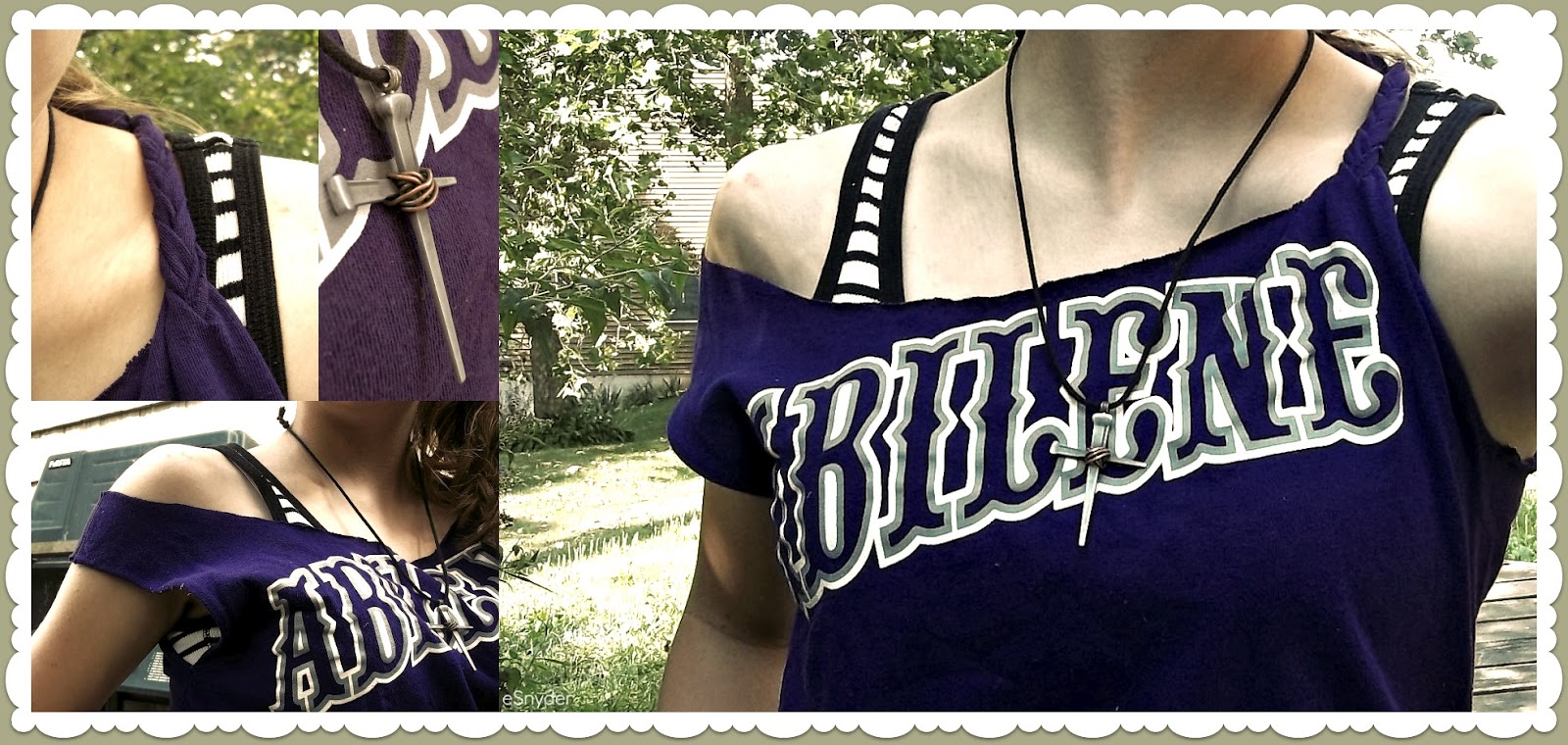
This was a fun little project I did with an old T-Shirt I never wore.

I put on the shirt and put a tank top on top of it, then traced the tank top line with a piece of chalk. (I made the straps a little wider than the tank top's)  Then I cut the shirt along the lines in the front and back.
 This makes a decent cut top. I could have left it that way, but I decided to keep testing ideas.

Taking the left sleeve, I cut along the seam at the top.  (You can cut it further back for a longer braid)
Cut the length of the sleeve into three strips, and then braid them to the end.  Then sew the end of the braid to the strap left on the back. I bunched up the strap and sewed further down the back so that it would pull the shirt up on that side.
I didn't like how open the other side was, so I also sewed the hole up a bit at the bottom.

Now I love the way the shirt turned out!

You could try the braid on both sides, or make the thick side a little thinner and keep it from falling off your shoulder.

(Neat trick, if you don't want your straps showing, use a small safety pin to secure them under a tank top.)

Wednesday, June 6, 2012

Orange Bows

It's the end of the year, so tomorrow, the upcoming 6th graders in our school are being assigned to Houses. If you've been following, earlier I posted Elliot's House crest (Go Orange!).
Well, they are letting us wear house colors, so I decided I want to wear an orange bow.
Problem is I don't have one. But I have orange cloth, so of course I decided to make one.

Since I've never done this before, I found a really nice video to make it.  Just follow all of the steps and it should turn out fine! The only thing I changed is that I folded over the longer edges of the cloth inward so that I didn't have a frayed edge along the side of my bow. I had difficulties holding the edge in the whole time, but once it's sewed in place, it's not as hard.  I don't usually mess with cloth.
(Yes, the first time it took me a half an hour with a bad needle, but it gets easier the more you do it.)
To put it in my hair I slid a bobby pin through the back of the center loop, and it held up pretty fine. I also suggest sewing over hot glue, because it holds longer, unless you want a quick project or have no needles.

Here is my Bow:

So cute!

I really enjoyed making it, and I'm considering making ones for all the girls in my House next year.
Girl power!

(Update 9/2/12)
I've finished nearly all of the bows for the girls in my class! I also made magnets to go with them for their lockers! (The small bow can be cut 2"x5" or adjust as you wish.)


Magnets Print


Monday, April 23, 2012

Calm, Odd, and Peaceful

An odd collection of photos.


(edited by PicMonkey.com)

Saturday, December 10, 2011

T- Shirt Designs

This is only a sketch, but here is a T-shirt design I drew up.
The top is the front, the bottom is the back.
The bird on the front and the middle cross on the back would be yellow, while the other two crosses would be red. And the shirt is black.


Tuesday, October 18, 2011

Shoe Logo

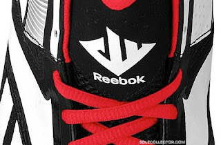
The other week, a good friend of mine asked me if I would design a logo for him. He wanted it to be a design he might put on a pair of basketball shoes to sell, like the one for the John Wall basketball shoes:

If you can see, the logo is a combination of a "J" "W" and "11".

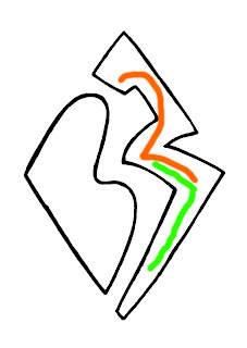
So I set my pencil and paper to work to draw up something similar, and this is what I came up with with his initials and number of choice: BW27.

IN BLUE!

IN ORANGE!

(If you can't tell, this is where I incorporated the 27:)
(This design belongs to myself and B.W. and no one else may use this without written consent.
I'm getting 20% of his profits from this, if he does something with it. (: )

Saturday, October 15, 2011

Youth Group Logo

Our Youth Group has been discussing making some changes this year. One thing we have considered is having a logo to use for things such as T-shirts. I took some time to draw up some ideas, and I mostly focused on a "new creation" concept from 2 Corinthians 5:17. I considered drawing a shoot with some roots, roots showing our growth being deep, but this design looks even better.

[In case the image isn't loading, it is a shoot with three leaves (Trinity concept!) with a shadow as a cross. ]

House Crest


With this new school year, our school decided to add a House system (if you don't know what that is, read Harry Potter.). We have five Houses, and I am the leader of the Elliot House. So, to go with our House and House Hero (Elisabeth Elliot, a remarkable woman), I designed a crest for our House to use.

It includes two spears shaped like the ones that killed Elisabeth Elliot's husband and the four other missionaries with him. The spears form a cross to represent how this tragic death was used to continue to reach out to the tribe and bring them to Christ. The "E" is for Elliot; it was designed by Amy (I cleaned it up a bit), and it provides an original and unique quality to our crest. Our motto is "Victoria de Tragodea" which is Latin for "Triumph from Tragedy"--a saying that relates to how God has created something good from every bad situation Elliot went through (ex. the death of her first and second husband), and from Jesus' death.

Outline
Color

Sunday, September 11, 2011

Sunny Day in September

After days of clouds, rain, and flooding, we finally had a beautiful white-cloud, blue-sky day outside. I grabbed my sister's camera, my memory card, and ran outside to get some shots. I saw two Monarch butterflies near our butterfly bush, and managed to get a good picture of one of them!
Here are some of the best pictures I took:


Wednesday, August 24, 2011

Taken by Tide


So the band formerly known as Far From Rectified has just recently(today!) changed their name to Taken by Tide--this means that I get to create a whole new band logo for them! :D
So this band was just recently created by three of my friends, Brandon, Brandon, and Alec. They haven't posted any music yet, but I've known for years what styles they like, and have an idea of what to expect.
I decided to model their logo after Alec's guitar, to give it the look they were looking for. It also gives the word Tide more of a tide, oceaney kind of feeling, which I though would look neat.
So please, comment and let me know what you think of it!
Here's there page for you to check them out on Facebook!

Band's Logo

Sketch

Photo of Band Members, edited by Picnik.com (their fonts as well)


Sunday, August 21, 2011

College Trip

This week, my family (except my youngest sister) drove down to Arkansas to drop my older sister off at college! On the way down I doodled a lot, and so I figured I would share the drawings with you! There are also some sketches from our stay there, so enjoy!


(All of these and more can be found under my Sketches.)

Tuesday, August 9, 2011

In the Style of Calder

In 9th grade art class, we were told to choose an artist and create a piece of artwork in his or her style. I chose one of my favorite artists Alexander Calder, and therefore created an abstract sculpture in his style. This one is made out of metal(some silvery, easy to cut, but firm kind), held together by some kind of bolt thing(thanks to my dad), and spray-painted black.
This specific type of piece is known as a stabile, compared to the mobile, which (fun fact!) was invented by Alexander Calder himself.
My piece still remains unnamed.


Thursday, July 28, 2011

PwaP Logo

This is a logo I designed for Performing with a Purpose. This was a Christian drama club from 2009-2010 at my school, run by Jenna Thomas. The club doesn't exist anymore, but I designed it for practice.


(Designed by hand, with the use of Paint, Picnik.com, and Aviary.com)

Tuesday, July 26, 2011

OneMotion Art

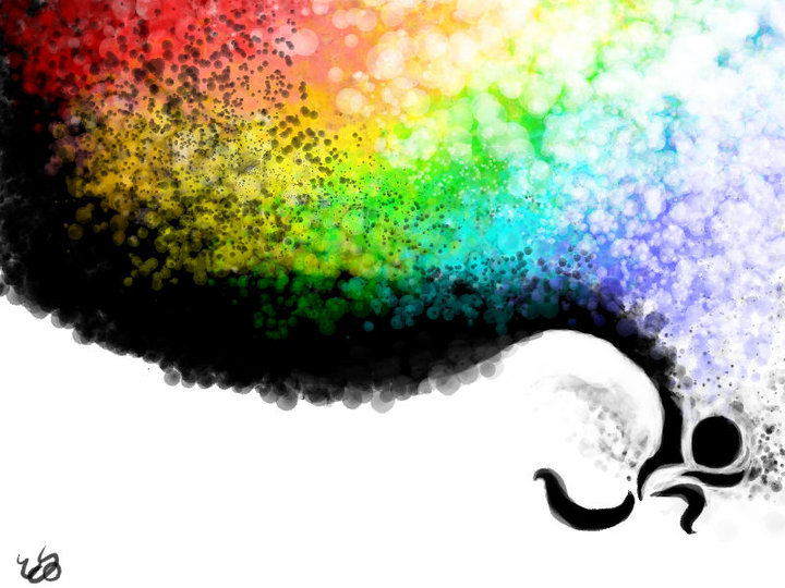
Some old artwork I did in May, 2010. I simply played around with brushes, colors, and techniques to come up with these designs. The following were my favorites.


(with the use of www.onemotion.com/flash/sketch-paint/)

Sunday, March 20, 2011

Pennsylvanian Farmlands

One weekend in February, we had a nice warm day out, so my sister and I drove out to the "countryside" to take some nice pictures. We packed sandwiches and ate out by an old covered bridge. She got some neat shots of that bridge and a few old farms that were nearby. On the way home, I took advantage of her camera and managed to take some neat pictures while she was driving.


(with the use of Picnik.com)